A well-designed Contact page on your website can make all the difference in the world.
If you’re running a service business, most likely the call to action on your website is to reach out to you. So, if your website has managed to ignite the interest of a potential client, don’t let them slip away because of a poorly designed Contact page.
More often than not, when you visit a website’s contact page, what do you find? A phone number, an email address, maybe a physical address, map, or a generic message form to submit. It’s a common scenario, and let’s face it, it can be really frustrating. And it isn’t helping your business.
A bad Contact page leaves clients in the dark, wondering what to do, or what will happen next. It forces them to overthink writing a message to an impersonal ‘info@company.com’ – not knowing when or if they’ll get a response. The last thing you want to do is annoy a potential client, or diminish their trust in you.
Here are 5 things to consider when building a great Contact page
1. Don’t make people think too much or work too hard
Too many options are confusing. Not offering clear direction on the best course of action leads to unnecessary mental effort. If you’ve inspired someone to reach out, don’t dampen their enthusiasm this way.
Adding a clear sentence to your contact page like “Give us a call to schedule your free on-site estimate” completely solves that problem. Be sure to include your hours of operation. Simple and easy!
2. Streamline your process and free up your time
Offering a booking page instead of a traditional contact form is a highly efficient way for individuals to reach out to you. This way clients can view your availability in real-time and select a suitable time slot, without the need for back-and-forth emails or phone calls.
The initial step in my process involves scheduling a “good fit” meeting. Even when clients contact me directly, I ask them to visit my website to book a call. Having them follow my process not only helps build trust, it saves me so much time. By using a scheduling tool that integrates with my calendar I can allocate blocks of time for these calls, instead of answering calls and emails as they come in. (I personally use youcanbook.me, and Calendly is really popular.)
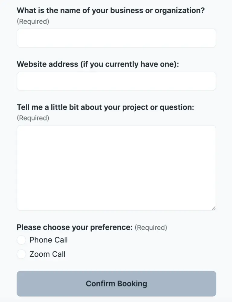
Additionally, on my booking form I collect some information from clients upfront. I ask for their website address and to tell me a little bit about that they need, so I can prep before me meet. A calendar invite with a Zoom link is sent to them, along with a reminder email. It’s an incredibly efficient system. I highly recommend it!
Plus! You can put a “book a call” link in your email signature, on your Google Business listing, and on your LinkedIn profile.

3. Filter out the people who aren’t a good fit
Taking calls and answering questions for customers who aren’t a good fit is a waste of everybody’s time. Your website should help you attract your best type of client and deter those who aren’t a good fit, and your Contact page can help even more.

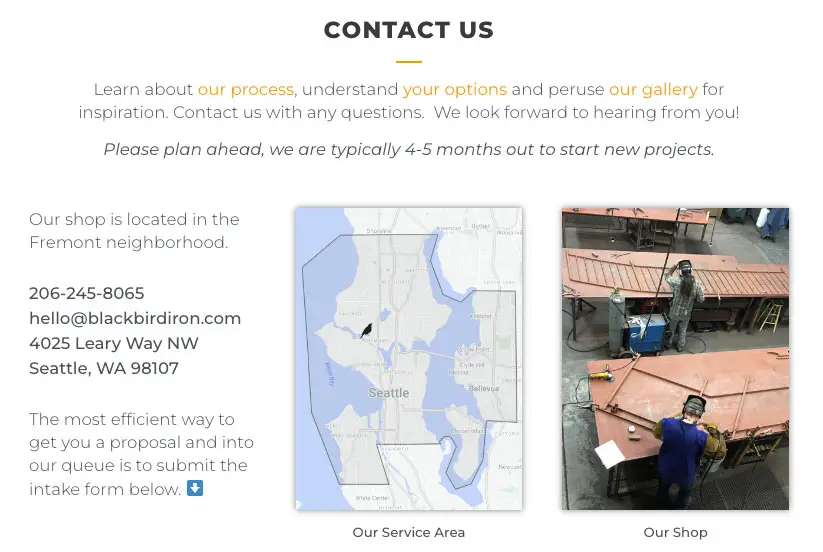
Here’s how a local ironwork shop does it:
- On Blackbird Iron & Design’s contact page it says “Please plan ahead. We are typically 4-5 months out to start new projects.” So if you’re in a hurry, they’re not for you.
- There is a map of their service area, because it’s not cost efficient for them to travel too far.
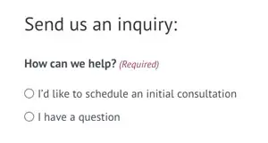
- Their web inquiry form has a checkbox to choose your type of project. If there isn’t an option for your type of project, you’re not a good fit.
- They also request that you upload a photo of the location for your project so they can determine right away (without any email back and forth) if a metal railing can be installed in your crumbly old concrete steps, avoiding a site visit only to find out they can’t.
There are so many ways a well-designed Contact form can help you weed out clients that just aren’t right for you.
4. Set and meet expectations

5. And always remember, email sucks.
Before you simply slap an email address on your contact page, heed this warning: it can lead to unnecessary chaos and missed opportunities, not to mention spam.
Yes, we all rely on email, but the last thing you need in your life is more email sucking away your precious time. Don’t you hate all that back and forth, the pressure to respond right away, and the guilt you feel when you don’t? And while you’re not responding to their email, potential clients are shopping around for more bids. It doesn’t have to be that way!
If you’d like some help creating a Contact page to better support your small business, just click the button below to schedule a quick chat. (See what I did there?)